By Varda Meyers Epstein
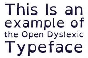
Wouldn’t it be great if switching fonts was all you had to do to conquer your reading difficulty? Imagine that for a moment: you toggle a magic switch (or dropdown font menu in WORD) and poof! You can read like the best of ’em. Well um, no. Unfortunately, this is not and probably will never be the case, despite the creation of self-proclaimed dyslexia-friendly fonts such as Lexia Readable, Open-Dyslexic, and Dyslexia.
 What is true is that some fonts make it even more difficult to read text (for everyone) and by the same token, others make it easier to read text (for everyone). And anything that makes it easier to read text is going to be appreciated by those who struggle to make sense of letters and words. That, in and of itself, is a good goal: making reading easier. (Note: Dyslexia is not a visual problem, but some fonts do wreak havoc for even very smooth readers.)
According to multiple surveys and studies, the most readable fonts tend to be the fonts that are known as sans serif or “without serif.” The word “serif” is French and signifies the little tail attached to the end of a stroke in writing some letters. Many of us don’t notice these little add-on flourishes, but they can make it difficult for struggling readers to know where letters and words start and end.
Any font that is “sans serif” is therefore, already a cut above when choosing the ideal font for readability. Some refer to sans serif fonts as “Grotesque” or “Gothic” and serif fonts as “Roman.” Examples of sans serif fonts include Helvetica, Courier, Arial, Calibri, Tahoma, Trebuchet MS, Verdana, CenturyGothic, and
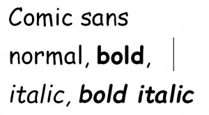
Comic Sans. Of these fonts, Comic Sans is judged t o be the most readable. Unfortunately, Comic Sans doesn’t look very professional—in fact, it was invented to be used in comic strips. Lexia Readable was meant to address this problem of professionalism: it has the good readability of Comic Sans but doesn’t look quite so, well, comic. A good font alternative for business or academic purposes is Trebuchet MS. Graphic designers have taken note of the fact that, according to some estimates, one in four people has a reading difficulty. In response to this concern, the British Dyslexia Association (BDA) compiled some data on the subject of readable fonts.
The BDA found that readers with dyslexia prefer:
- Strong ascenders and descenders on b, d, f, h, k, l, t, and for capital letters such as G, J, P, Q, and Y.
- Distinctions between b and d, and p and q, rather than mirror images
- Capital I, lowercase l, and the numeral 1, should have different forms
- The lowercase g should be rounded as in cursive script (rather than in the doubled form of the serif fonts). Most people with dyslexia like a rounded a, but some feel the rounded a too closely resembles the o.
- Letter-spacing should be wide enough so that letter don’t run into each other. Example: r and n typed as rn, should not look like m so that “modern” ends up looking like “modem.”
As for special dyslexia fonts, the above mentioned fonts, Lexia-Readable, Open Dyslexic, and Dyslexie, are free (open source) downloads. Sassoon, for children, and Sylexiad, for adults with dyslexia, are specially designed to be easy to read, but must be purchased. Finally, there are dyslexia-friendly fonts that are used by publishers only, such as Barrington Stoke (for children) and Read Regular.
Other Tips
In addition to using fonts that are easy to read, there are other tips we like to suggest to our mentors working with children in one or another of our Kars4Kids mentoring programs:
- Don’t let the font size drop below 12pt.
- Don’t double-space after periods as this creates vertical rivers of white space in the text. Called the “river effect,” double-spacing after periods may make it hard to see where sentences begin and end.
- Don’t use pure white for background or pure black for text. Some gray added to both background and text colors cuts down on glare and prevents blurring.
- Avoid italics and choose bolding instead to add emphasis. Italicized letters with their jagged edges and “leaning Tower of Pisa” effect, are nearly illegible to some with reading issues.
About the author: Varda Meyers Epstein is a staff writer at Kars4Kids, a Guidestar Silver Medal Charity, where she also serves as editor of the Kars4Kids Educational Blog for Parents. Learning Ally is a national nonprofit that serves children and adults with print disabilities, like dyslexia or visual impairment. You can help by volunteering your time, giving a monetary donation, or by donating your vehicle.